

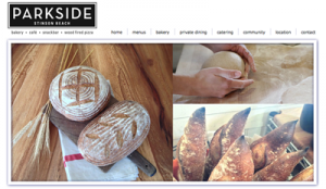
How do you define good design for a restaurant website? It should be informative, functional and perhaps most importantly, a restaurant website should be mouth-watering. Through imagery and copy, a restaurant's website should effectively bring the table, the plate, the menu, the kitchen, and the entire restaurant ambiance to the web. Here are five noteworthy examples. WebSight Design client Parkside Cafe: The first thing a visitor sees when landing on the homepage of this popular pit stop for Stinson Beach goers is photos of house favorites: Dungeness crab & rock shrimp risotto, a perfectly prepared fried egg, and the essential cheeseburger. The images rotate to tell a visual story of the cafe: an elegant table setting, wood-burning pizzas, the bakery and hearth breads, the exterior of the restaurant, a hungry crowd, and irresistible soft serve ice cream. Additionally, the Parkside Cafe website provides the story of its setting in Stinson plus fundamental details of locations, hours, menu, and social media. Click here to visit parksidecafe.com.
The acclaimed Gotham Bar and Grill restaurant website opens with a simple plated dish and the caption "Timeless American Cuisine." So sets the mood for the website. While visitors manually click through the slideshow, restaurant reviews appear in the top left corner. Beneath the homepage hero images, two feature boxes take the website content beyond the restaurant: an online journal and a link to a direct-to-consumer Flourless Cake for sale. An interactive timeline adds to the website's completeness. Click here to visit gothambarandgrill.com.
Gitane's website perfectly captures the swagger of this San Francisco restaurant: "sexy playfulness"¦ 1930's cabaret"¦ and the audacious spirit of the 70's disco era." The backdrop of the website creates a dark and moody atmosphere. The reservation feature at the top of each page makes it easy for visitors to honor "one of the most time-honored Spanish traditions of eating well.
Chop Shop, in Chicago, distinguishes itself from the aforementioned websites in that it does not launch with an impactful, colorful, food-filled slide show. In fact, the stripped-down all black and white design is a statement in and of itself. The simple layout is refreshing and the website offers only essential information. To experience Chop Shop, you'll have to visit in person. Click here to visit chopshopchi.com.
Coming to us from the fabulous foodie town of Seattle, Ethan Stowell Restaurant Group is a good example of how to cohesively incorporate many restaurants under a single web site umbrella. Unique features of the site include: The MKT website shares photos and bios of its Crew, this brings nice humanity to the site. Each of the individual restaurant pages has an Instagram-Esque Gallery that depicts its current comings, goings, and restaurant personality. Click here to visit ethanstowellrestaurants.com.
