

WebSight Design clients cross many categories of business and culture, including the likes of several notable artists. It is the job of the web site designer and developer to showcase the artists' creative and unique identity online while presenting relevant information and achieving internet marketing objectives. Here are 5 sites that achieve these goals with great design.
When setting out to design & develop HGTV's Design Star, Danielle Hirsh's web site we knew we wanted her personality and expertise to be the prominent content. Visitors are greeted on the homepage with a friendly portrait of Danielle. The tag line "inspiration for life" establishes the mood for the site. By placing "today's tip" front and center, the web site stays current and offers a reason for visitors to return. Between the blog, photos, and videos, Danielle's web site provides a wealth of tips and helpful information.
In designing Mary Holman's web site, our objective was two fold: market Mary's personal training business and highlight her poetry. The site is simple and the layout and serves both purposes. The visuals on the site blend the objectives as well. A backdrop of blue river stones is positioned with photos of Mary as a trainer and perhaps conjures up a poem. Mary uses Twitter to share her poetry and haikus. A perfect and not often used way to use the micro-blog site.
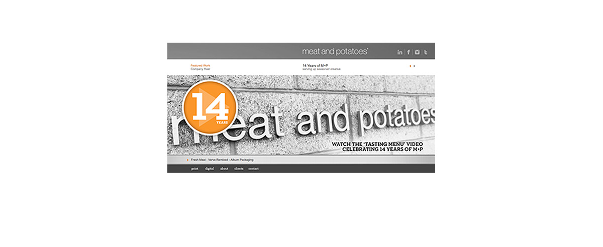
Our partners in design, LA-based firm Meat & Potatoes present a visually striking web site with a modern feel. A predominantly neutral-toned home page is highlighted with an orange seal pronouncing "14 years". The seal defines the firms authority and clicks to the Company Reel, flashing images of their work alternating with white on black text and accompanied by the music of Raconteurs. The video clip establishes the tone for Meat & Potatoes branding in dynamic way. The homepage rotates through featured clients and that is the focus of the website, a portfolio of the firm's work.
In contrast to the first two web sites we looked at, Katy Kuhn's web site does not open with a photo of herself. In doing so, Kuhn's "abstract landscapes, people, and objects" are the focus of the web site. The header of the site is Kuhn's name in script, which one may guess is her signature and offers the site a personal touch. A Gallery section displays her works in gallery settings. The visitor can read Katy's CV, Artist Statement, and about Events. Rather than a standard black and white pallet, the backdrop is off white and the text off black.
For an artist who innovates with materials including "the tears of a friend, a cup of Pacific Ocean, Cheez Whiz, mint jelly, and fast-food counter condiments", one may find Matthew Brandt's web site to be simple and straightforward. Courier New font, white on black is classic as a typewriter. Similar to Kuhn's site, Brandt's site presents information on his Works, Exhibitions, Projects, and his Bio. Kuhn and Brandt both provide contact information, but neither has links to social media sites.
