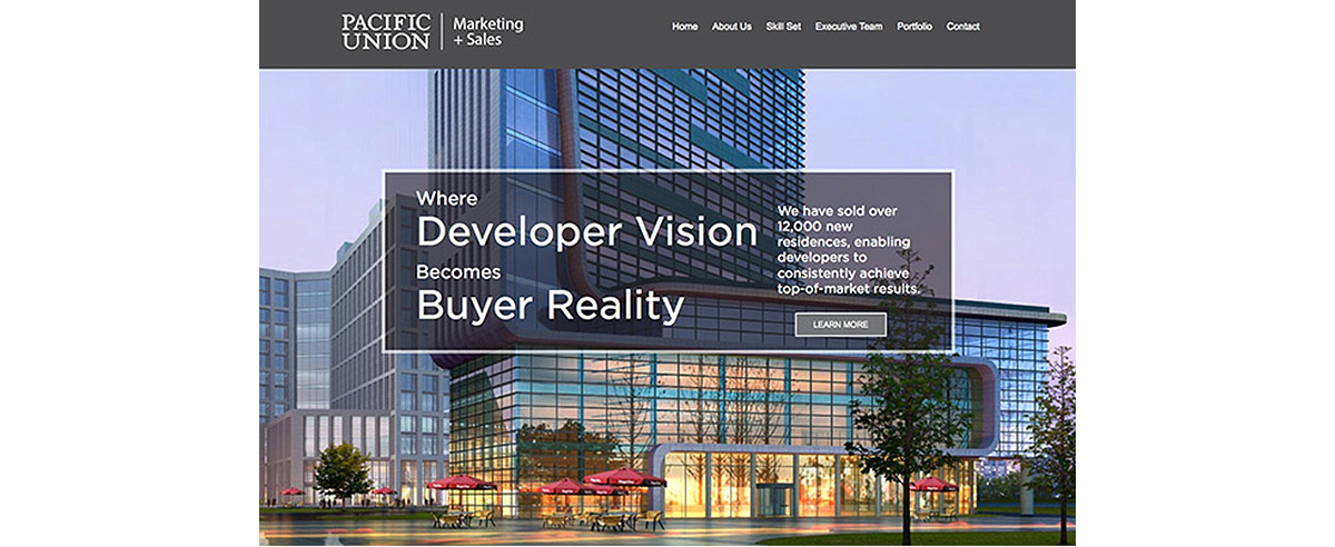

Sometimes, a fresh look can be useful. On the web, it's inevitable. It is necessary to keep up with progressive design, to bring fresh attention to the source, and to portray a more organized look. On the web, redesigns are necessary to provide readers with ease of use, to reorganize content, and to rebrand a business.
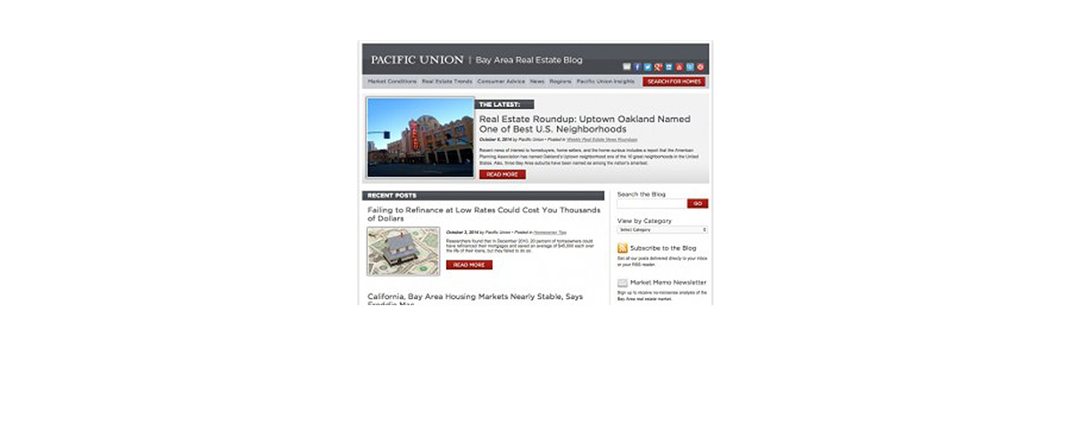
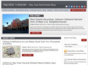
Recently, WSD re-skinned Pacific Union's Blog to correspond its design with Pacific Union's main website. The new design includes a darker and more unified header, as well an updated navigation bar.
On the home page, the most recent post is highlighted at the top of the page with a larger featured image and title, and other posts are organized below by date in descending order. The search bar has been kept in the top of the right column of the page for accessible and quick access to find precisely what you're looking for.
With ease of use in mind, WSD reorganized content and established categorization. Content is structured in the navigation bar by six categories. Browse by market conditions, real estate trends, consumer advice, news, regions, and Pacific Union insights.
A blog can be one of the most important pages on a website. Since fresh content is added frequently, a blog is SEO's best friend. All of the appearance changes will have no affect on the brilliant reputation the Pacific Union blog upkeeps, nor will the re-design negatively affect the SEO that has been strategized for each individual post. The blog will continue to deliver the same educated and cultivated content, just with a fresh look.