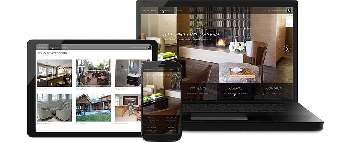

Interior designer Jill Phillips is a long-standing WebSight Design client; WSD launched her original site in 2008. With the growing importance of mobile, Jill approached WSD at the end of 2014 for a redesign with the primary objective of mobile accessibility. The refurbished website mirrors Jill's simple, sophisticated & timeless aesthetic. Aligned with Jill's creative vision, WSD designed a functional, responsive & sharp-looking website without any unnecessary bells or whistles.
WSD deployed the new site in March 2015. As an interior designer, Jill's work is visually compelling; therefore, it was key for WSD's Creative Director, Stephanie, and front-end developer, Dean, to implement a plan that maximized her portfolio. The new homepage puts her amazing work front and center. The hero images on the homepage highlight the site's mobile responsiveness, where they are shown in a full-screen view, regardless of the size of the user's mobile device. Streamlined navigation takes on a progressive and fluid feel with a font that is all caps and italicized.
We delivered a site with a distinct brand appeal, despite the fact that Jill doesn't have a logo or fixed brand guidelines. Jill receives most of her leads from referrals or through her Houzz portfolio, so the Houzz logo and link are incorporated into the navigation at the top of the page. WSD opted for a gallery of large thumbnail images to showcase Jill's design portfolio without having to invest in costly hi-resolution photography. The result: a visual layout that leverages the use of Jill's existing lo-res photos in a powerful way. Visit www.jillphillipsdesign.com to learn more about Jill and her unique design expertise.
