


Pacific Union Partners (PUP) is a fully-faceted real estate development company that has developed approximately $2 Billion worth of residential, commercial, retail and hospitality properties in the San Francisco Bay Area, Napa Valley, Northern California, Oregon and Washington. In spring of 2023, WebSight Design (WSD) launched a new website https://pacunionpartners.com.
WordPress Rescue
Pacific Union Partners approached WSD in 2020. At that point, PUP had a third-party designed WordPress (WP) site. WSD essentially engaged in a “WordPress rescue,” which included fixing up the plug-ins, stabilizing the site on our hosting platform, and performing long overdue maintenance.
WSD came to know Matt Tunney and Katya Greene during the first phase of the process. Over time, they became frustrated with the limitations of WP and agreed with our recommendation to redesign the site completely from the ground up in the WSD code base.
Front-end Design
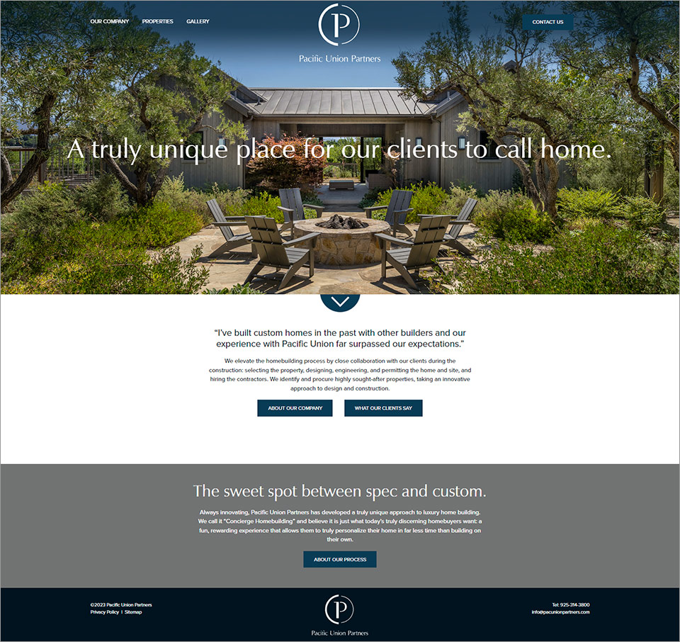
PUP’s previous site had a black background, gray text, and deep-toned photos, making for an overall dark experience. From a readability standpoint, the gray text on black was problematic. Gray is one of PUP’s brand colors, so WSD incorporated it into the redesign, but in more brand-supporting ways.
WSD used many of the existing photos, but the client also provided new ones, which were brighter, daytime images instead of evening ones. Additionally, WSD introduced a highlight color, a new peacock blue that works with the PUP gray, for buttons and other elements that are meant to catch the user's eye and direct the user through the site. While the photo gallery feels simple, the code behind it will allow for the client to expand this as more projects are complete.
