


Functional and beautiful website design.
Custom User Interface Design
Responsive, unique, and full of impact – a smart design will make your message shine.

Marilyn Jaeger Skincare
Master Esthetician
marilynjaegerskincare.com

Best of Raleigh
Community Business Listing
bestofraleigh.com

LS Adaptive
Adaptive Clothing Company
lsadaptive.com

Douglass Winthrop Advisors
Investment Advisor
douglasswinthrop.com

Kipling Capital
Wealth Management
kiplingcapital.comm

Michael Shower
O'ahu Realtor
michaelshower.comm
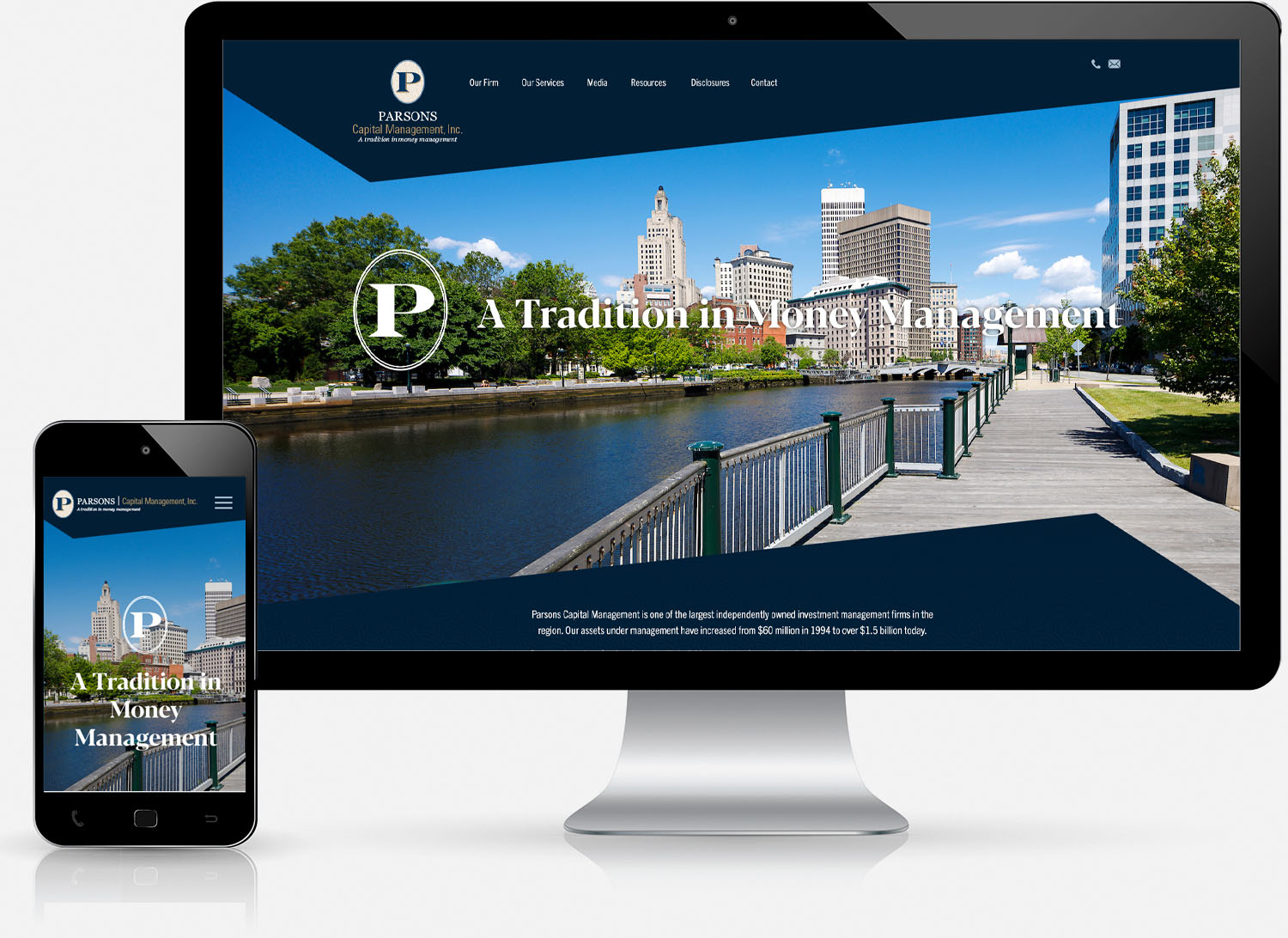
Parsons Capital
Investment Management Firm
parsonscapital.com

Jennifer Fearon
Artist
jenniferfearon.com
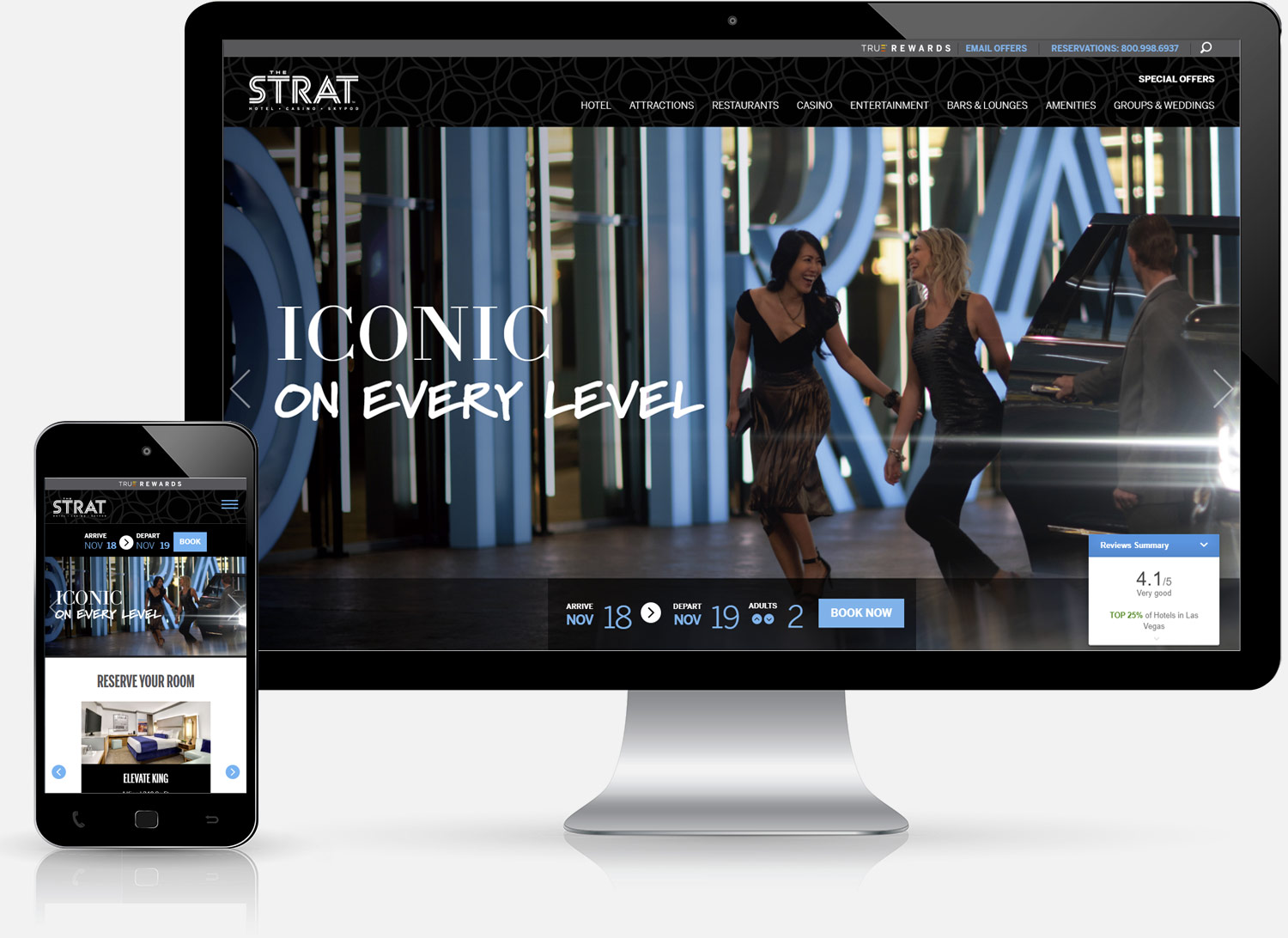
The Strat
Las Vegas Hotel & Casino
thestrat.com
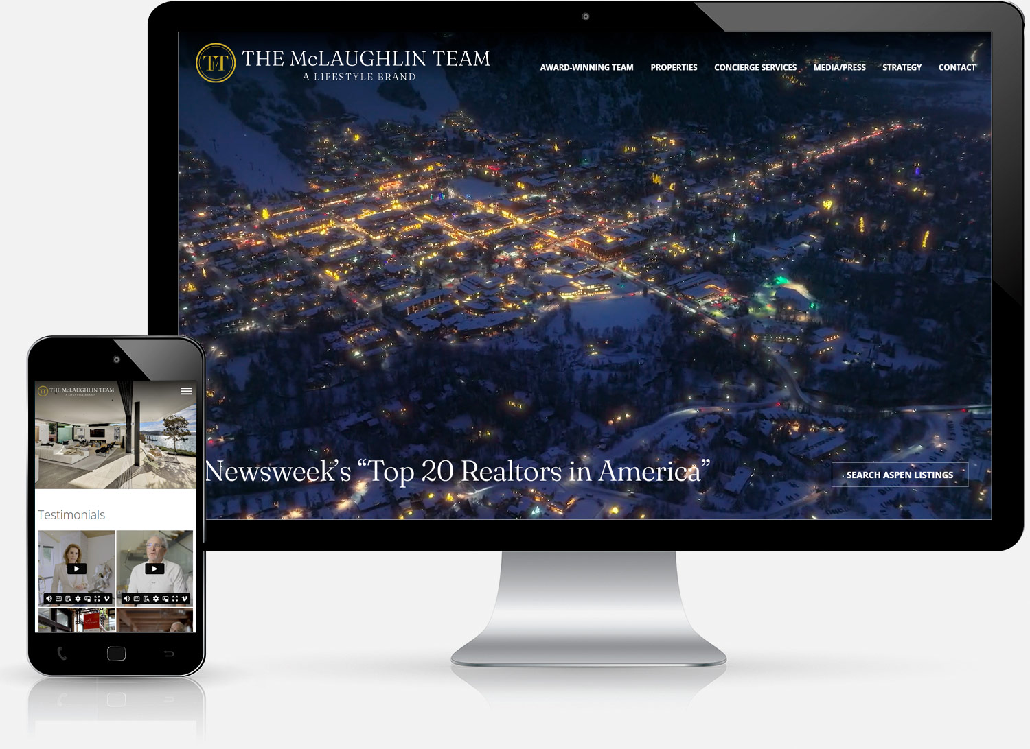
The McLaughlin Team
Aspen Realtors
mclaughlinluxury.com
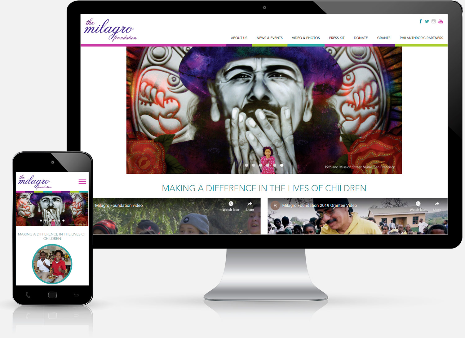
The Milagro Foundation
Charitable Foundation
milagrofoundation.org